Thrive Designs
Services

Shaping an architectural identity through the concepts of façades and brickwork.
The Opportunity
Architect Tithi Patel was establishing her independent practice, Thrive Designs, with a few projects already underway.
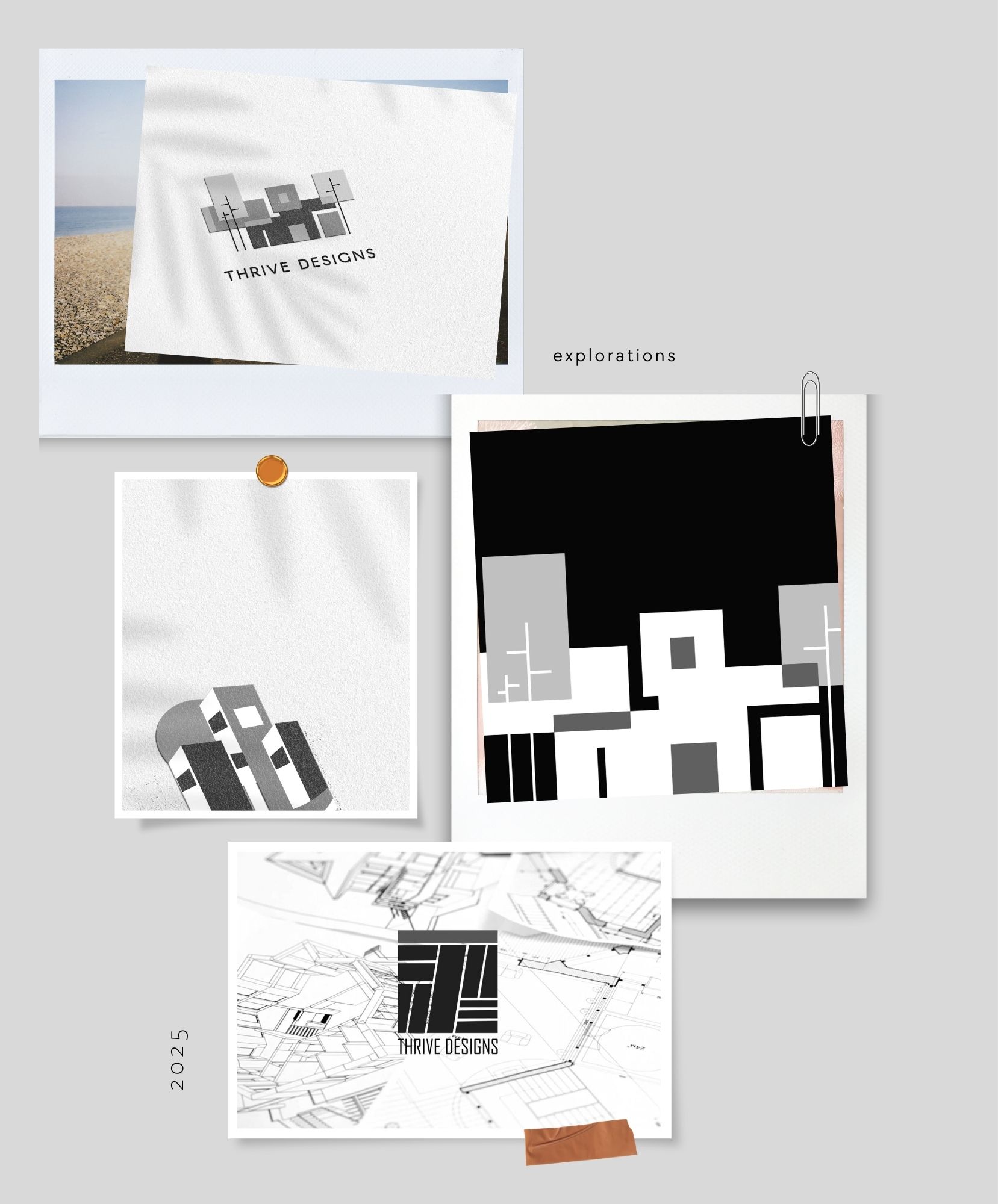
The studio needed a visual identity to introduce the practice professionally. With an open brief, we explored a bold, minimal direction that connected the name with architectural forms.
The Approach
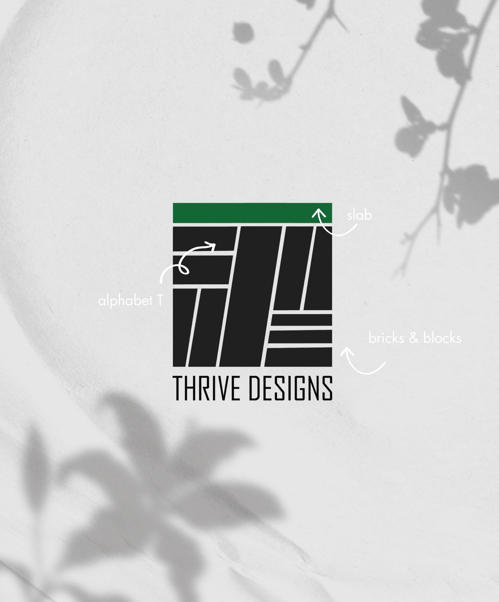
We made the letter T the starting point, exploring how façades, ceiling structures and brickwork could shape a single symbol.
The aim was to bring these references together without overcomplicating the mark, keeping the studio’s initial prominent and recognisable.
The Identity
The resulting logo combined geometric architectural forms within the letter T.
A colour palette inspired by sustainability and natural materials complemented the symbol, while lightweight typography gave the bold mark room to stand out.
We presented three initial directions. Tithi favoured this concept from the first presentation and returned to it after a further exploration.
The selected identity was extended across stationery and print collaterals, giving the practice a consistent set of client-facing materials.
The Outcome
Thrive Designs adopted the identity immediately as the practice began taking shape.
The project gave the studio a distinctive architectural mark and a coordinated visual language for its stationery and printed communication.